
20
20
PORTFOLIO
cliffrianne.my.canva.site
20
24


Cliffrianne Sim
Cliffrianne Sim
I am a passionate and motivated artist proficient in crafting captivating illustrations and graphic designs for print, web, and social media. My dedication to professional growth drives me to constantly refine my craft and explore new frontiers of artistic expression.
EDUCATION
EDUCATION
BACHELOR OF ARTS - GRAPHICS AND MEDIA
Cebu Institute of Technology - University
2016 - 2019
WORK EXPERIENCE
WORK EXPERIENCE
RIPECONCEPTS INC.
Design Associate & Quality Assurance
Contractual 2019 & 2020
SOFTWARE EXPERT SYSTEMS
Medical Illustrator
2020 - 2022
Junior Project Manager & Visual Management Admin
2022-2024
FINBERTY
Social Media Visual Content Designer
2024 to present
- Adaptability
- Teamwork
- Critical Thinking
- Interpersonal Skills
- Attention to Detail
- Communication
SKILLS
SKILLS
ILLUSTRATION
PACKAGING DESIGN
GRAPHIC DESIGN
CORPORATE POSTERS

20
20
ILLUSTRATION
traditional paintings - digital works
20
24

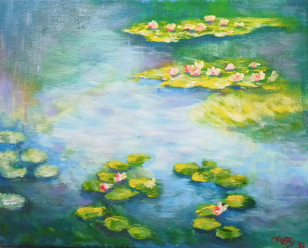
TRADITIONAL PAINTINGS

DIGITAL WORKS






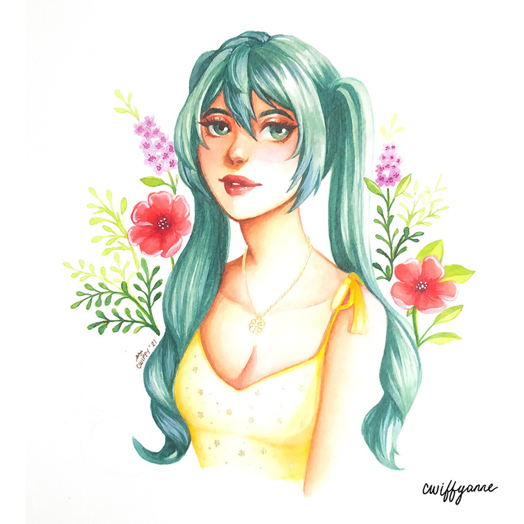
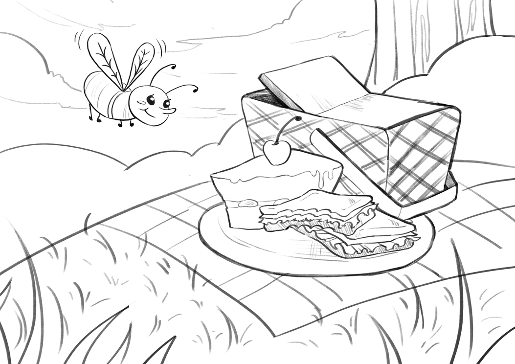
DIGITAL WORKS




20
20
GRAPHIC DESIGN
corporate posters - print & ad - packaging
20
24

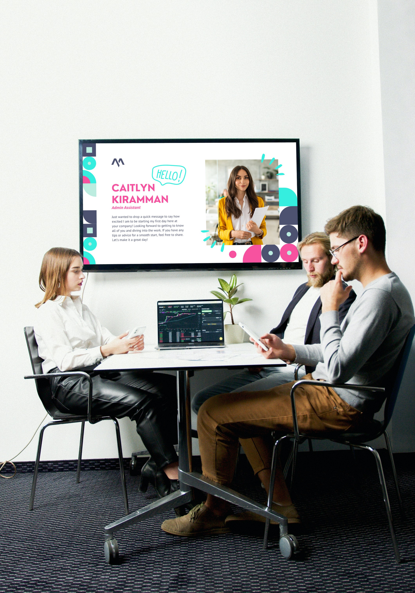
CORPORATE POSTERS
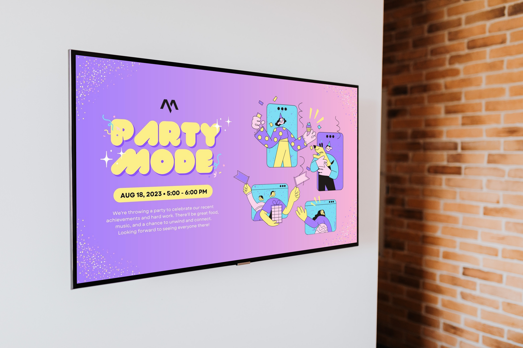
Incorporating lively corporate posters that promote the company's values and professionalism in the workplace. These visuals, which include encouraging remarks and achievements, promote collaboration and efficiency while creating a positive atmosphere at work.








SOCIAL MEDIA CONCEPTS


SQUARE INSTAGRAM POST
ANNOUNCEMENT POSTS

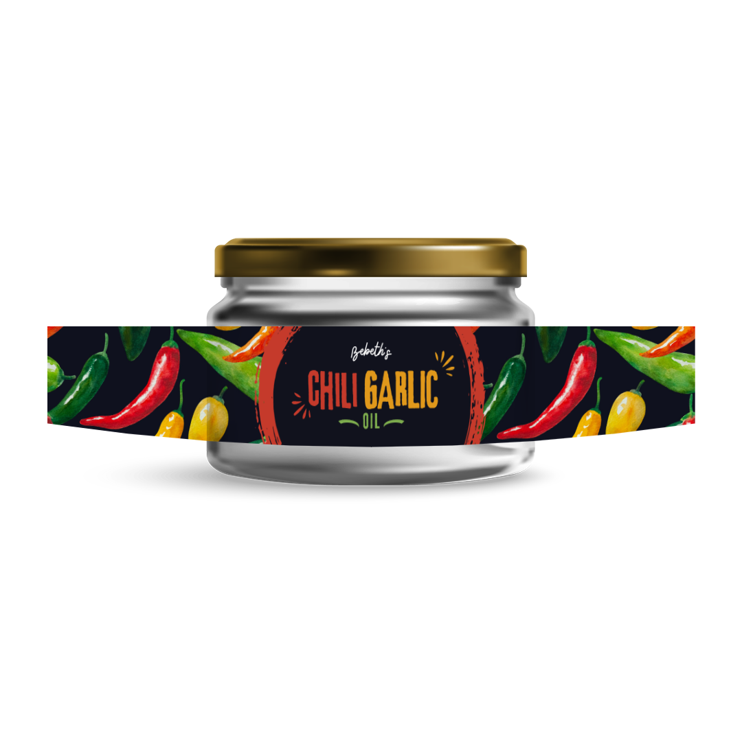
A packaging and logo design designed in Canva for a chili garlic oil that would fit in the desired small glass jar.



POLVORON BOX
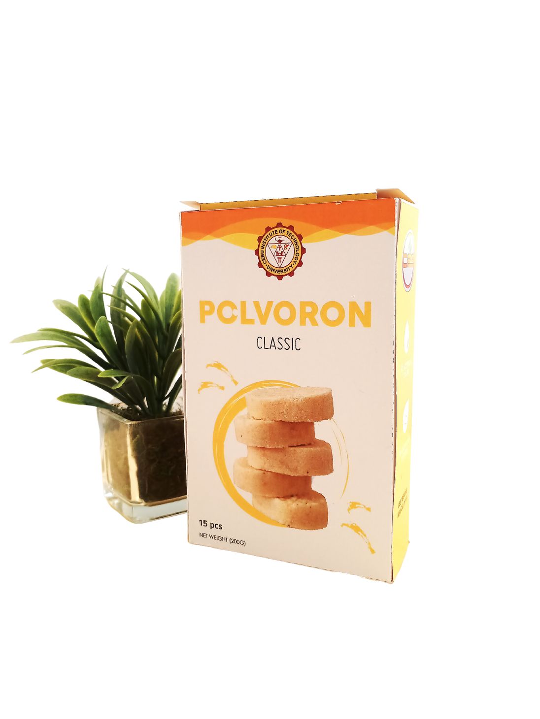
The criteria for this college project was
to create a concept polvoron box for
the Community Extension Services.
I designed the box to be simple and
direct, using the school’s main colors:
Maroon and Gold.
It was for the mothers at the Community
Extension Services that handmade
polvorons. The packaging needed to
be affordable for the school without
complication in terms of mass
producing the box.

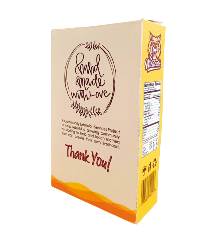

BACK & SIDE VIEW OF THE BOX
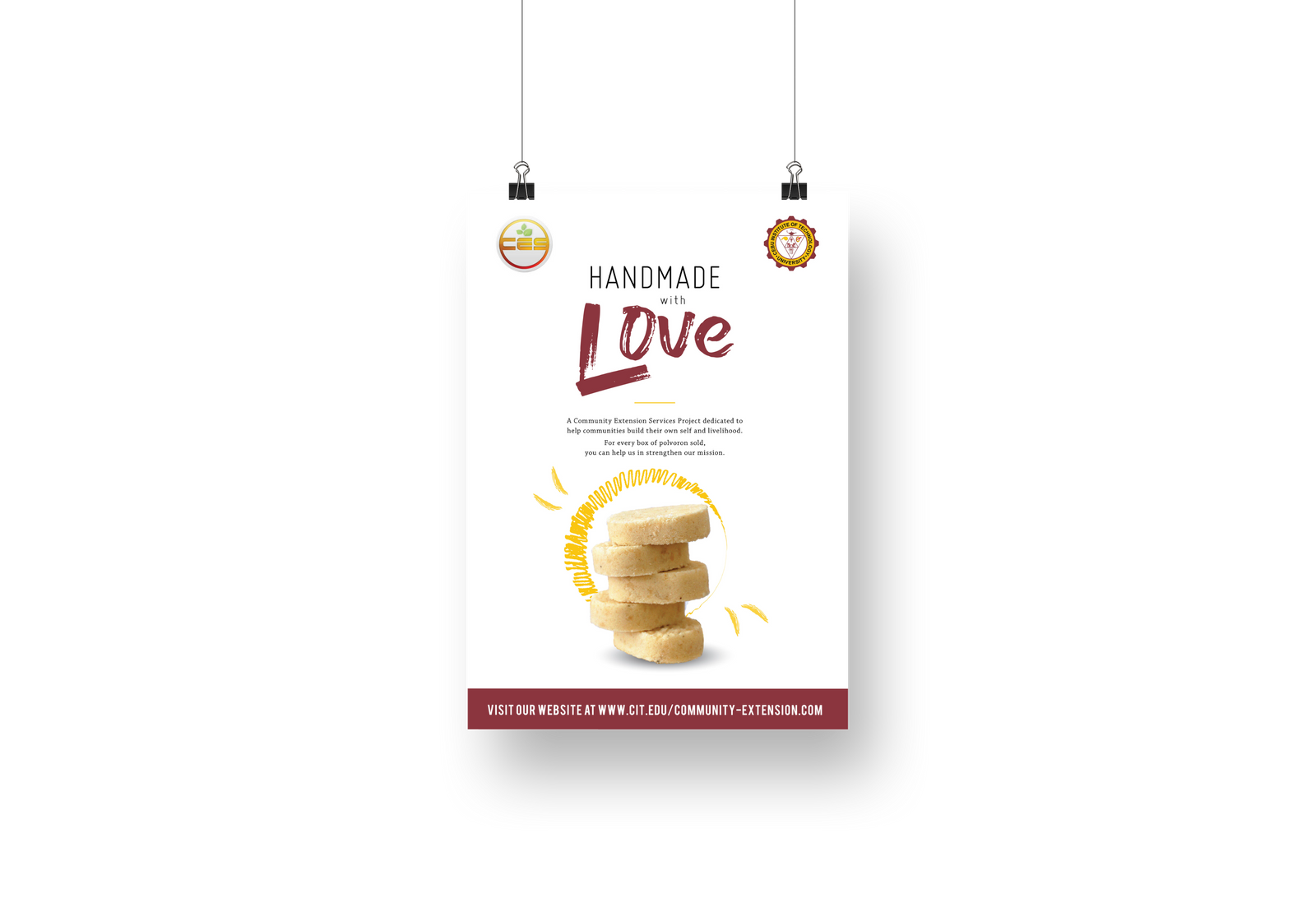
SAMPLE POSTER FOR WEB AND PRINT


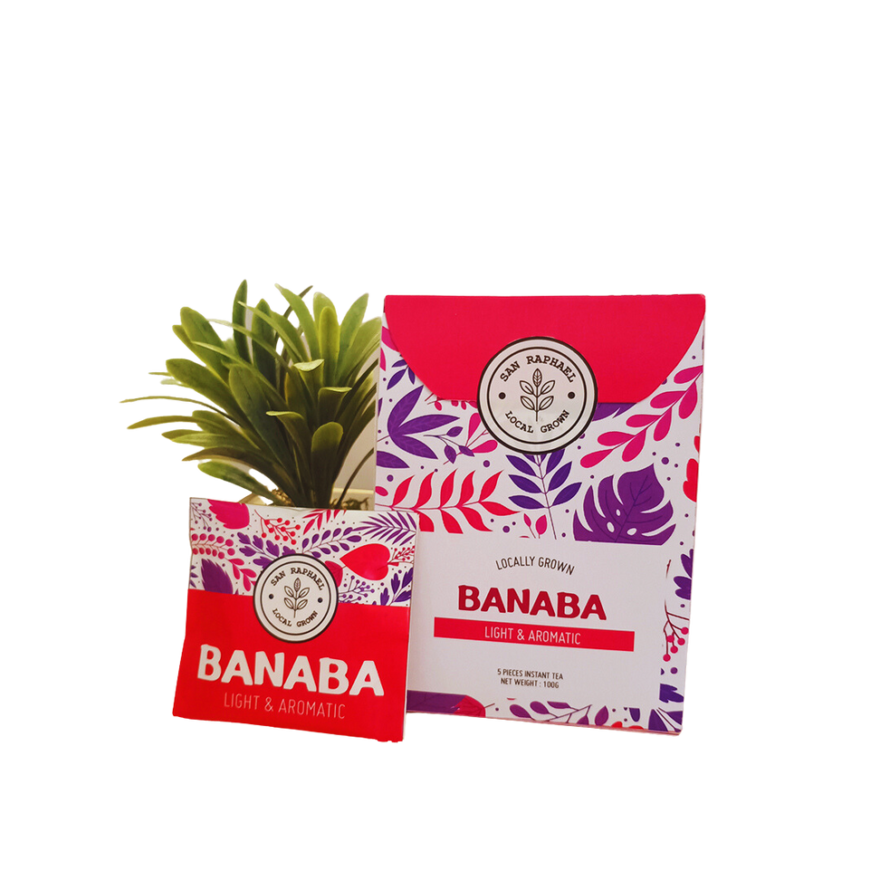
SAN RAPHAEL
The criteria for this college project was to
rebrand and create a modern look for the
logo and packaging design of San Raphael.
I chose a box similar to a teabag, adding a
unique way to attract a consumer to the product.
I wanted the design to have an updated look that can compete with other products on the grocery shelves. The logomark is a vinyl sticker to prevent from any tampering with the product.


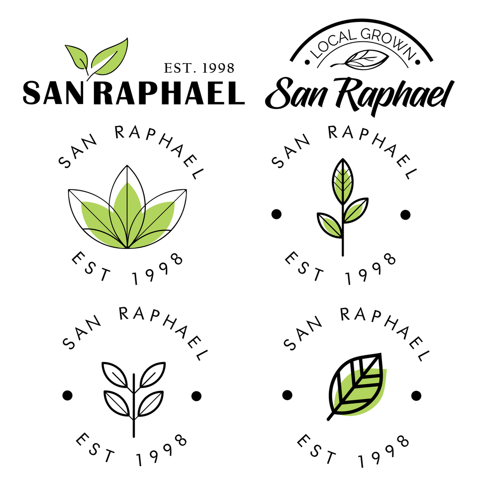
LOGO CONCEPTS
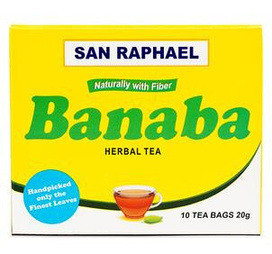
ORIGINAL LOGO

FINAL LOGO
The logo is designed to be minimal and easy
to look for on a grocery shelf, where the packaging design will have a
fresh feel to the brand.


